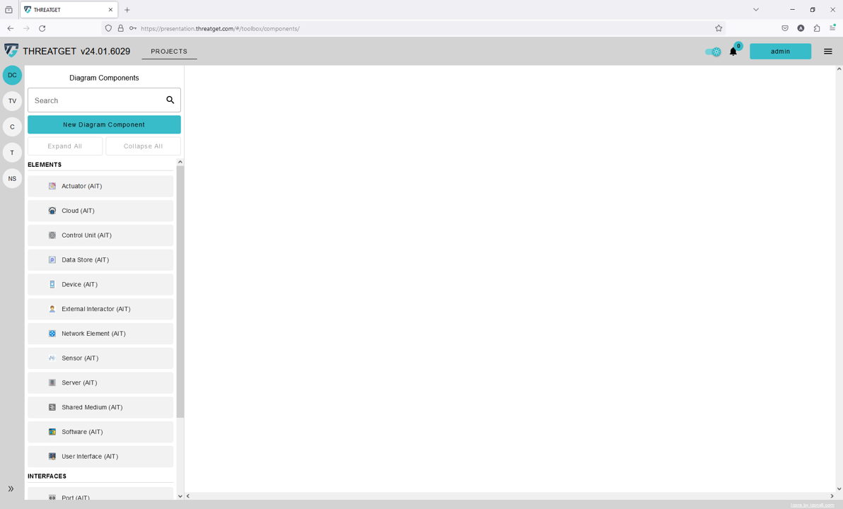
Diagram Components
THREATGET contains a collection of components (such as Elements, Connectors, Interfaces, and Boundaries) that the user can use to model their required scenarios. However, in some cases, the user needs to create new customized components to model a particular scenario. With the ThreatGet web interface, users can create and update their own diagram components, as well as interact with them. Before delving into the ThreatGet components, the following diagram gives an overview of the difference between Elements, Connectors, Interfaces and Boundaries.
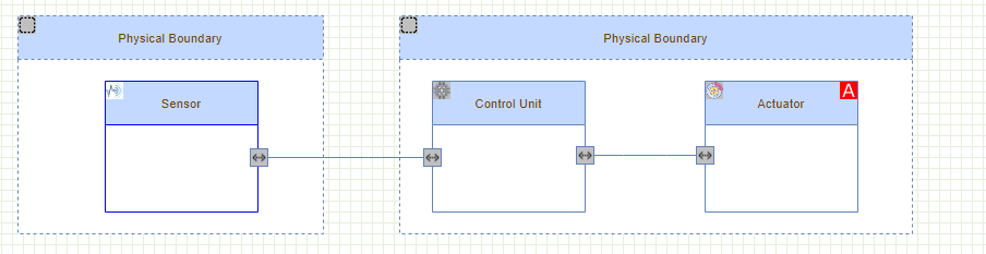
The diagram shows that a Sensor and an ECU are defined as elements. Connectors allow these elements to be linked together. Assets refer to vital items that require additional security precautions. Assets in ThreatGet can be directly connected to element(s) or attached to connector(s) using Asset Connector. Boundaries are used to define a scope of a collection of elements and assets.
In the general context, a connector describes a connection between two elements. This connection can be considered physical as well as logical. For example, you want to check the connection between two elements, wireless or wired. Alternatively, you want to investigate what kind of data is exchanged between these elements. Boundaries can be seen as a container for one or more Elements. They can also collect physical or logical features. Elements, Connectors, Interfaces and Boundaries can be grouped into hierarchies as a set of groups of elements and sub-elements.
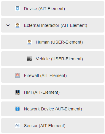
There is a superordinate category External Interactor and several subordinate elements like a Vehicle. The security characteristics are defined for the top category (i.e., External Interactor) inherits its properties to the derivatives below.
Each element has a defined namespace (e.g., AIT-Element), which can be found next to the element's title within parenthesis. You can only change or delete Elements you have created.
Note: Elements provided by the AIT cannot be updated or deleted. The Namespace is described in the Configuration/Namespace section.
Create a new Element
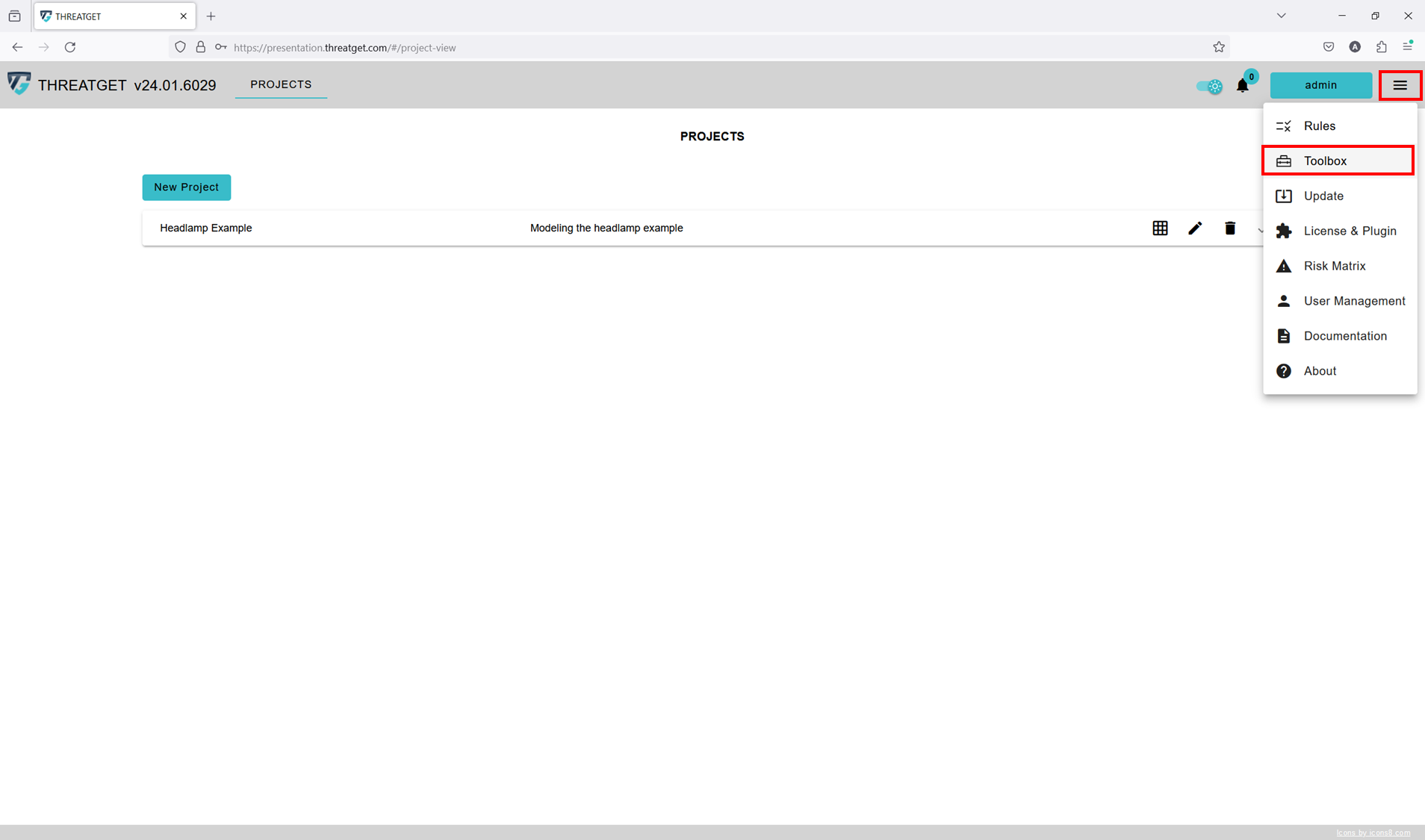
To create a new Element, you first have to switch to the correct overview. Please click on Toolbox in the Navigation Bar, as shown with RED marks in the picture below.
This opens the overview with the defined elements. You can already see all defined Elements, Connectors, Interfaces and Boundaries in their hierarchical structure on the left side.
In order to create a new component, click on the New Diagram Component button on top of the listing to the left.
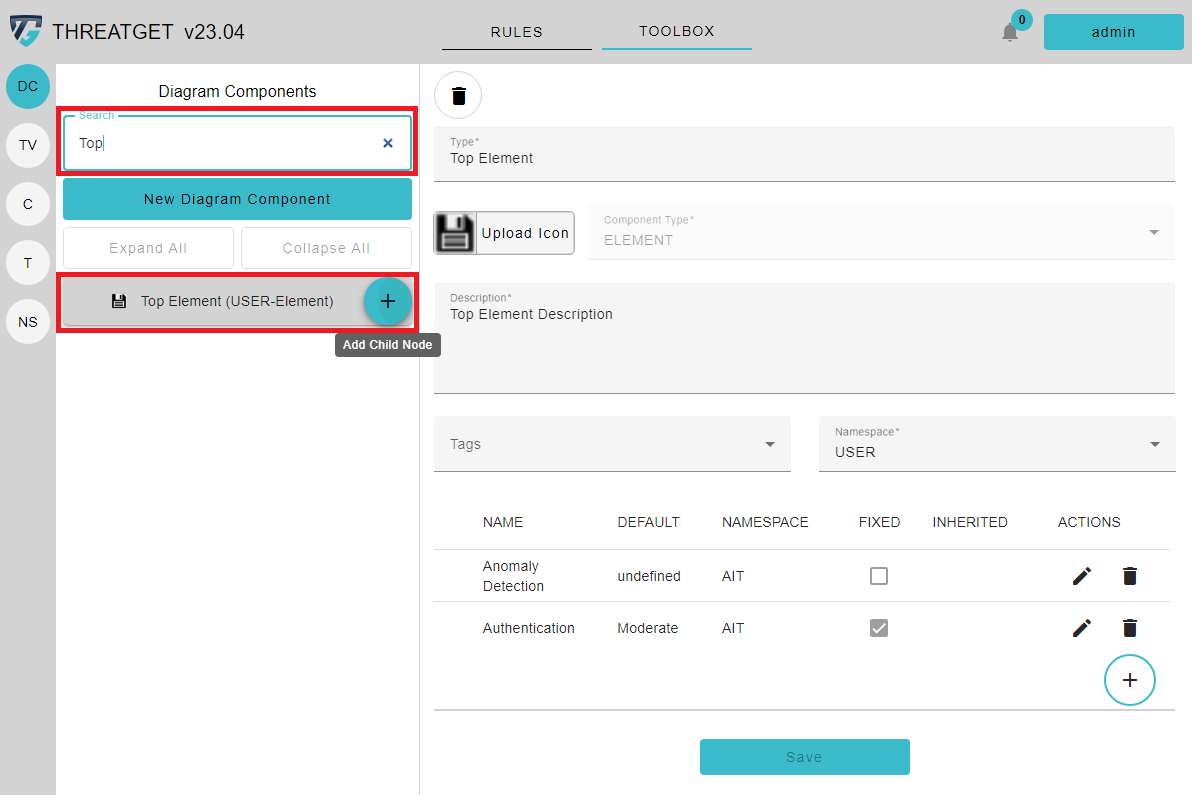
This opens a new form to the right in which you can define the name and select the type of the desired component. In this case, we define the name as "Top Element" and select the Element as the component type.
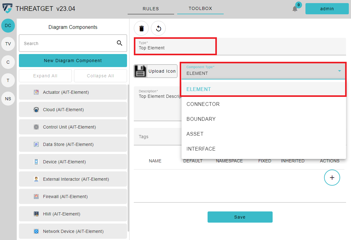
The following window is then displayed to start to add more relevant details into your desired element.
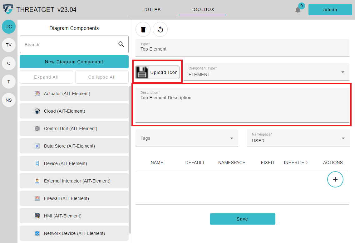
Here please now enter a Description for the created element. You can define an Icon, if the default ones are not appropriate. If so, please click on the Upload Icon button and select the desired image to add the icon and image. Image size and resolution are automatically adjusted. Please only use PNG or JPG images.
You can also change the Namespace. All elements you create have the default namespace (in the standard installation called "USER"). You can, however, select a different namespace.
In the lower part of this window, you can see a table where entries are still missing. The table displays all Tagged Values that have been assigned to this element. These Tagged Values describe the security/safety properties of diagram components.
Press on the + button inside the table to add tagged values to the newly created element.
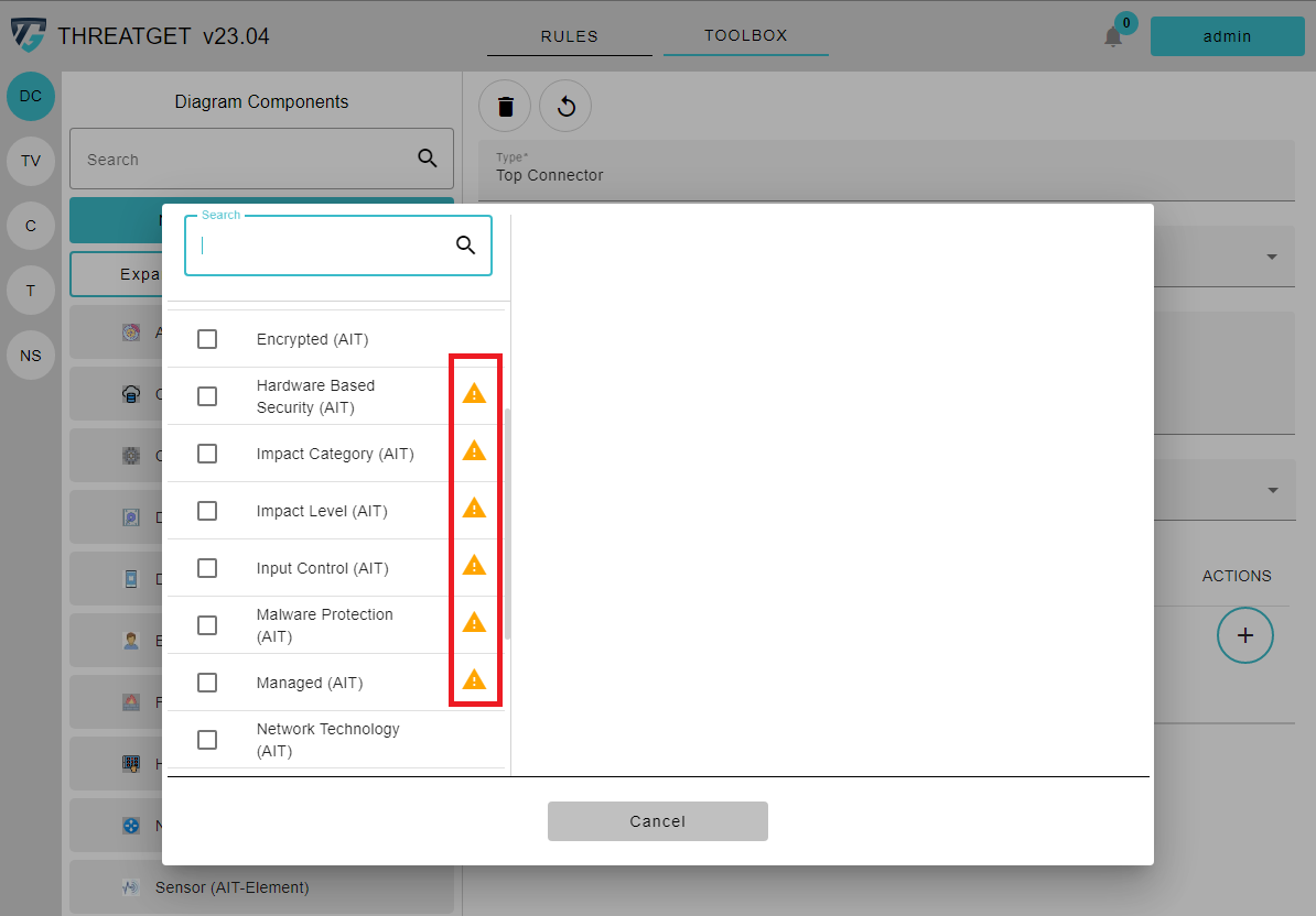
A dialogue opens in which you can review and add the Tagged Values you want.
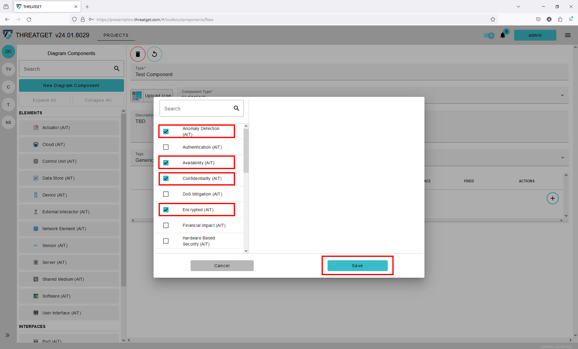
You can see all the Tagged Values that can be added to your new element on the left side. If you click on one of these, the details are displayed on the right side. Here you can review the Tagged Value and change the Fixed setting. The Fixed setting specifies if the Default Value of the Tagged Value can be changed inside of the System Model. If you click on the toggle button, the Values table below changes. It adds a new column FIXED where you can adjust the fixed value for this Tagged Value of your element. The yellow Warning Sign indicates that the Tagged Value is not intended for the diagram component you want to create. However, we do not restrict you if you want to assign a Tagged Value for a component. We simply point it out to you.
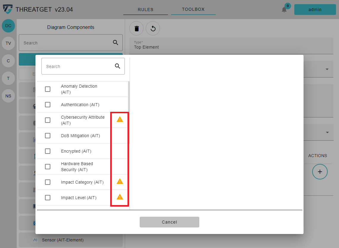
To add a Tagged Value, you have to activate the Checkbox next to the Tagged Value name. For example, you can just add the Anomaly Detection and Authentication tagged values to your element. Then click on Save in the lower right corner.
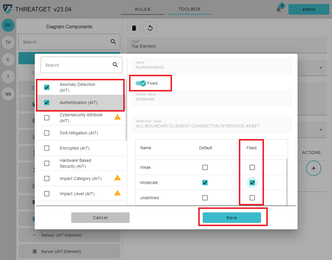
You can now see that the selected Tagged Values Authentication and Anomaly Detection are added to the table below. The difference here is that we changed the value of Authentication and Anomaly Detection to the Fixed Value Moderate. So if somebody uses these elements in the system model, the Authentication and Anomaly Detection values are constantly set to Moderate and cannot be changed.
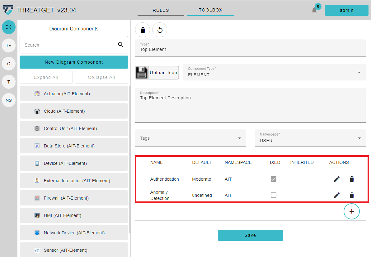
The column Inherited shows if a Tagged Value was inherited from a top element. This is not reasonable in this case because we created a new top element. However, we will see this if we create Sub-Elements of the newly created one (i.e., Top New Element). The user can use the PEN symbol to adjust the default or fixed value setting. In addition, a particular Tagged Value can be removed from this element by pressing on the Trash Can symbol.
On the left upper corner, you can see two buttons ("Circular Arrow", "Trash Can") and a Save button in the middle below the input area.
- Circular Arrow: to undo any changes.

- Trash Can: to cancel the creation of the new element or delete an element, click on the Trash Can.

- Save Button: to save your newly defined component, click on the Save button.
For now please save your new Top Element so we can create a Sub Element.
Create a Sub Element
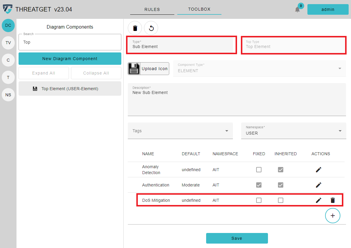
After creating our Top Element, we will now create a Sub Element. To find our newly created element faster inside all the defined elements, use the Search Field directly below the Navigation Bar. Please enter the full name or subpart of the element name that needs to be found.
If you click on the arrow of the element, where you want to create a sub element, a + indicating that if you click on this button, you can create a new Sub-Element, appears.
The window is almost the same as for the previously created element. Only now you can see the field for the Top Type, which describes the parent element name. If you look at the Tagged Values, you can see that the Authentication and Anomaly Detection tagged values are automatically inherited from the Parent Element. You can add additional tagged values as a new set of security properties for the new sub-element. The image and icon are as well inherited from the parent, but are adjustable if needed. In this case we added the value DoS Mitigation to indicate that the element can be secured against DoS attacks.
You can also add Tags to your element. These tags are different from the Tagged Values, as the purpose of the Tags is to group Elements, Assets, Connectors, Interfaces and Boundaries.
To add a Tag to an Element please click on the selectable Tags Input.
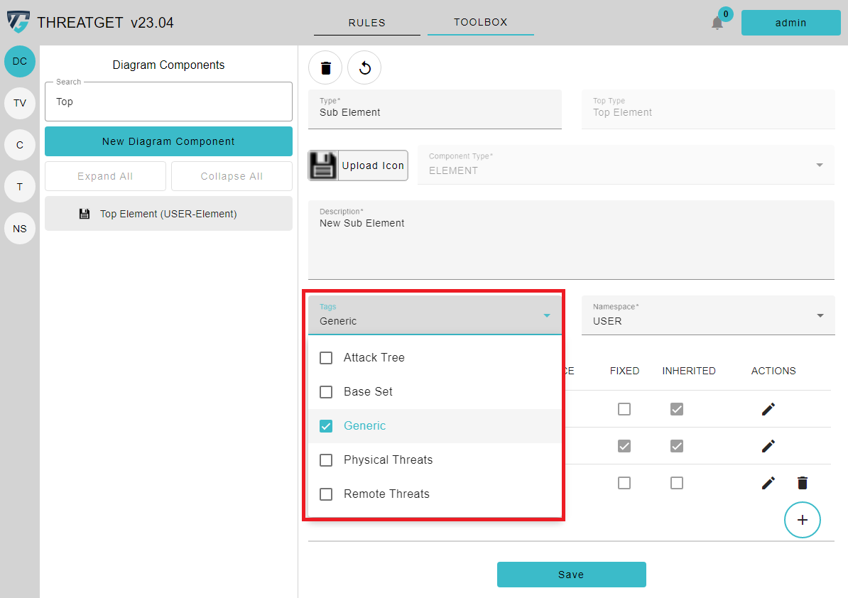
You can select as many predefined Tags as you want. To learn how to create new Tags please see the documentation for tag creation.
After you added enough tags, you can click out of the selection field, and the tags are added to the element. If you add Tags to the Top-Element, these tags get added to all the sub-elements. In order to save this new Sub Element, select the Save button below.
Creating a Connector / Boundary / Interface
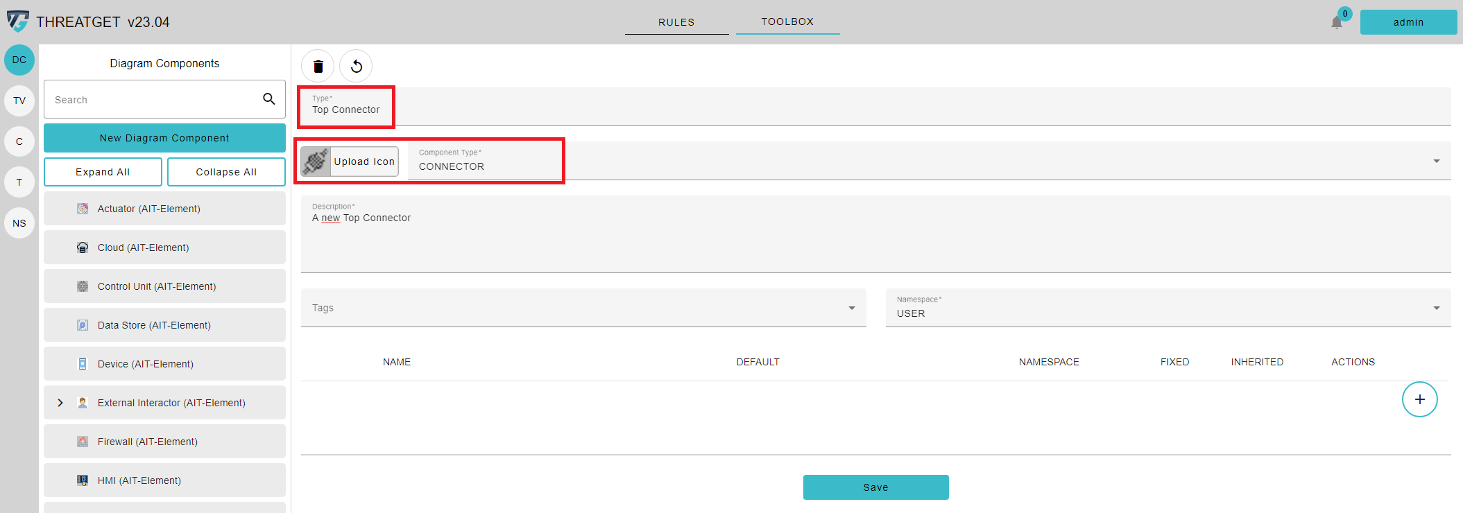
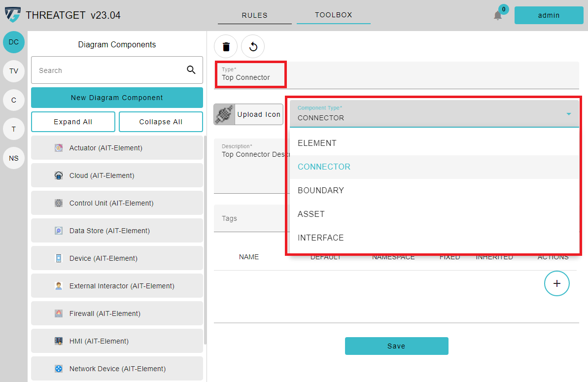
Creating another diagram component such as a Connector, Boundary or Interface is mostly the same as creating an Element and Sub-Element. To create a new Top Connector, click on the Create Diagram Component button. The input form allows you to define the desired type next to the icon. In this case, please click on Connector.
As you can see, it is the same view as creating a new Element. The only difference is that the preset icon is different. This is because a Connector should have a different icon than an element. You can change the icon if you want.
If you want to add new tagged values, you can follow the same steps we followed in creating a new element. But as you can see on the picture below other tagged values are marked with the yellow triangle, because it is a different component type.